Interaction Design Year 2: Modeling & Materials

Aubrie Hazlewood

Module 1

For this assignment we were required to explore 3d modelling interfaces and recreating both simple and complex objects found in real life. As you can see from my process work, I wanted to have a lot of fun with this! I really found that with the help of the tutorials and also some extra exploratory studies I developped some vital skill early on to ensure success in this design challenge.

Design Challenge 1
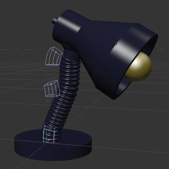
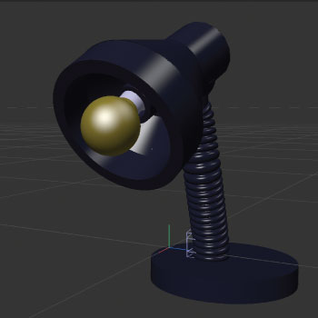
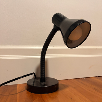
In this particular image, I had completed my final rendering of a 3d model of my lamp.
      I found the lamp to be the most interesting piece to do as it has many appendages and shapes involved. I wanted the shape to be dynamic and evokative of many shapes. I used many techniques learned in my other process work below. 
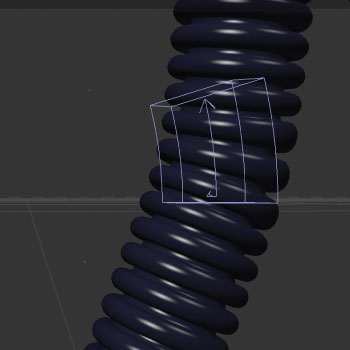
      some techniques includes the use of the polygon tool, using the boolean, and trying out different colors and textures. This image is a close-up angle demonstrating the work put into the ridges in the arm on the lamp.
      To accomplish this, I used the donut tool to make the outward ridges, and to further add depth i added smaller donut
      circles within along with the boolean tool to greate more depth in the ridges. This image is a close up demonstration of within the lamp light.
      I examined multiple parts of the interior of the lamp to make notes of ridges and layers involved.
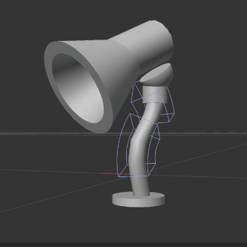
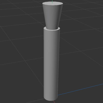
      I did my best to recreate the interior of the lamp using cylinders and the boolean tool to create the ridges and layers. This is an image of the bare bones of the lamp without the textures. I decided to create the parts of the lamp individually and then put them together in the end.
       I found this to be the easiest way to achieve the best product possible as many different shapes and techniques were involved. It got to be quite confusing at times to access certain shapes so 
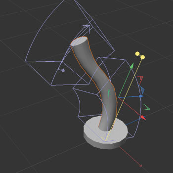
       I found that the separation and then merging of the shapes was the easiest. In this image, I wanted to demonstrate how I used the bend and twist tool to create various paths that are not rigid and straight
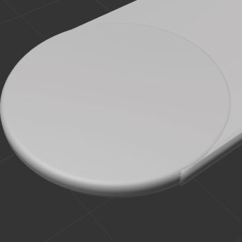
      I found that the bend tool was the best way to achieve the look I was going for as it gave me much more freedom to move the cylinder in a way that was more dynamic. This image is a close-up shot of one of the objects I was attempting to recreate using techniques practiced in tutorials.
      I found that rounding only one edge of the rectangle was very difficult and I could not figure out how to make it seamless. I found that the closest way that I was 
      able to recreate this was using a flattened cylinder and then using the width of the rectangle and applied it to the radius of the cylinder. I rounded the edges of cylinder to match that of 
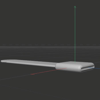
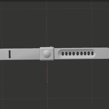
      the rectangle, and then united them with the boolean tool. Even though it was not perfect, I found that this was the closest way to achieve the real-life product. This angle of the watch demonstrated how I used the boolean tool to creat cylindrical shape to mimic the 
      inserts for the watch band. I found that using basic shapes like cylinders and squares and then rounding the corners was the best way to achieve this effect! I wanted to demonstrate my ability to emphasize and create complex 
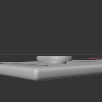
      shapes using beginner tools. I decided to involve this image to show that even in the small parts of the model, I had attempted
      to recreate raised notches within the watch band. I used the cube tool and then intensly rounded the edges to give it an appearence of an oval.
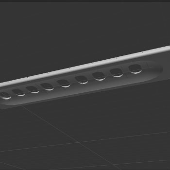
      I then put a cylindrical shape underneath to give the piece more depth. In the base of this watch, there is a sunken in portion on the watchband. When mimicking this,
      I had a very hard time trying to create an oblong shape that indents the watch band just enough, but not enough to appear on the other side.
      Upon further examination, I had decided to test out the capsule tool to mimic that oblong shape. I quickly noticed that by using the capsule tool I could create the oblong shape as shown on the watch itself. This image is a full view of the bottom of the watch which shows the other details that can be found on the watch. I relied heavily on the boolean tool
      to subtract and maneuver shapes arounnd to achieve the desired effect. In this image, I wanted to show my beginning process of how I would form the complex shapes.
      First and foremost, I would look at the object to see what kind of <I>basic</I> shapes I could use to mimic the object. Once I had an idea of what kind of shapes were involved, I quickly started to add more complex shapes to give the model more depth.
      For this model specifically, I was exploring the use of the donut tool to soften edges and create a more organic look. Once I had an idea of what kind of shapes were involved, I quickly started to add more complex shapes to give the model more depth.
      For this model specifically, I was exploring the use of the donut tool to soften edges and create a more organic look and then proceeded to use the boolean tool to subtract unneeded contents to make the transitions clean and pleasent to look at. This close-up look of the previous image clearly demonstrates how I picked up using the boolean tool to create seamless shapes and transitions.
      By using the subtract tool and by appropriately learning how to properly layer the shapes, I was really pleased how much I was learning. For this model, I had attempted to experiment with layering 
      the shapes to indicate elements of movement and function. I found that when I rounded the edges like in the previous models, it became very soft and unpleasent to look at,
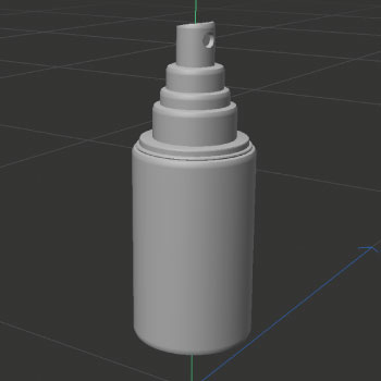
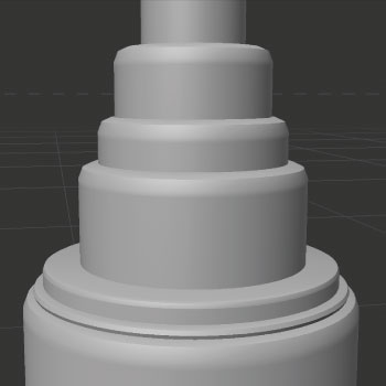
      but when i reduced the segments it reall made the shapes stand out yet still work together. This image is a close-up of the cylindrical shapes that i used to remake the top of the spray bottle.
      These shapes were created using the cylinder tool and then modified using the polygon tool that make the edges sharper. I had wanted to play around with the polygon tool to broaden my skillset in this program! This image gives another close-up of within the spray bottle showing further use of the subtract boolean tool and how it is very useful adding depth to a model.
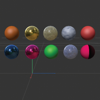
      Initially, I found that when I finished the spray bottle, I noticed that it seemed very flat and lacked depth only to notice that I actually needed to <i>remove certain elements</i> to make it look more realistic. In one of our tutorials, we were taught how to use textures, and adding masks to the shape created
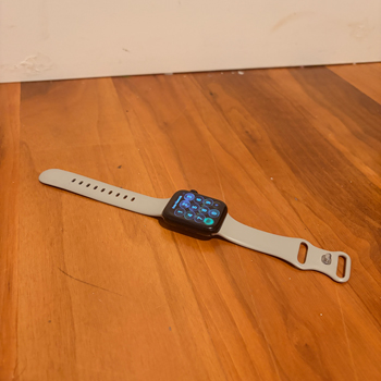
      When exploring these different textures, I was thinking about how I would apply it to my final object. When finding new textures, I experimented with lighting, and custom physical textures found within the application. The Apple Watch I found to be more of a complex object, as there were indents, grooves, and sunken in portions that require much time and effort to recreate. It has appendages that stick out from the sides and requires much finessing to become a copy as shown in previous images. When choosing this object to render as a 3d model, there was obviously a lot of thought that went into it. I had taken note of the direction in which the supporting arm could go and how it would require me to manipulate basic objects to create 
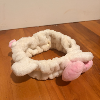
      a more complex form. There are shapes within like cones and cylinders that are masterfully manipulated, creating a complex object.  This headband was a very difficult object to define. I knew it was a complex object, but I could not exactly determine if it was considers many small vertical cylinders or a donut shape.
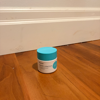
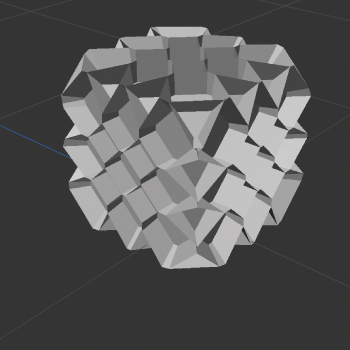
      I ended settling on the shape of a donut, but was able to see how there was texture of the fur and how it affected the overall complexity of the shape. When looking at this object, there are many moving parts, but when broken down into simple forms, it really is just cylinders and circles. I found the pattern on the top to be hexagonal and thought it would be an interesting format to recreate. This would be considered a simple object as it is clearly made of basic shapes. It sticks strictly to a cylinder and tubes.
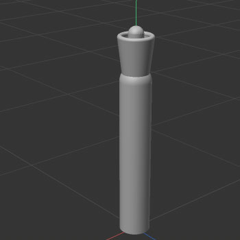
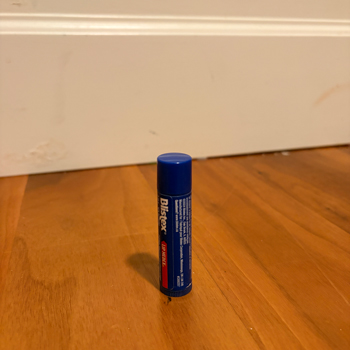
      This product has many moving pieces, for example the tube could be the portion moving the chapstick up and down, while the cylinder itself is holding it in its container. I had definitely gravitated to more circular and cylindrical objects for this assignment, even though I did attempt the uses of shapes like cubes or polygons.
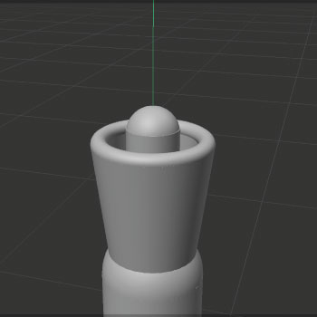
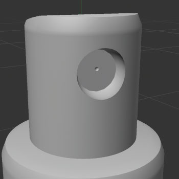
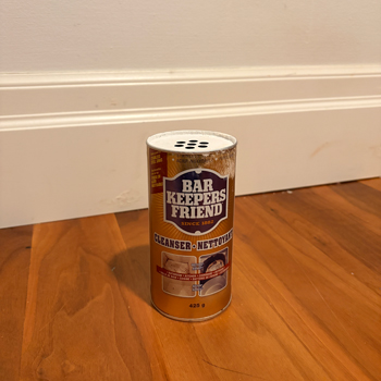
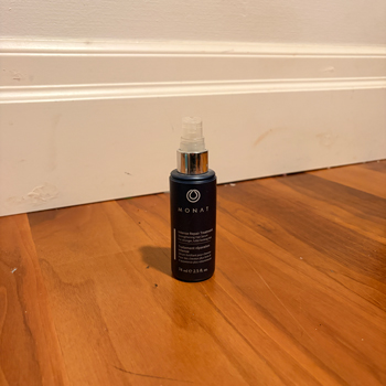
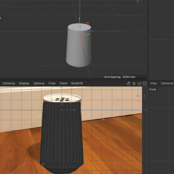
      I had tried to challenge myself into reducing objects to their most basic shapes and I found it to be interesting to try to see how I could add the bumps and ridges into a potential 3d model This hair oil clearly displays simple shapes, as it is almost totally made out of cylinders. when referring to my test model above,
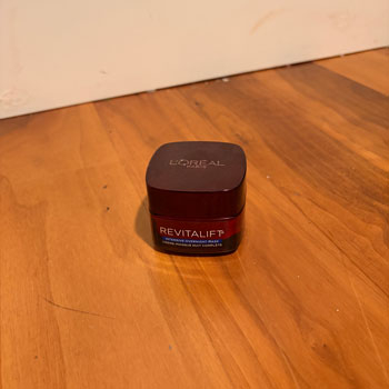
            you can quickly notice groves on the top pump where the users finger should go. I had decided to recreate this by once again using simple shapes like the sphere to create the desired effect. Looking at this image, I found it to be very simple in shape, with only rounded cubes being used.
      I thought how fun it would be to make iterations of this object, and identify how to go about doing engravings of brands and logos.

Design Challenge 2
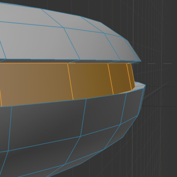
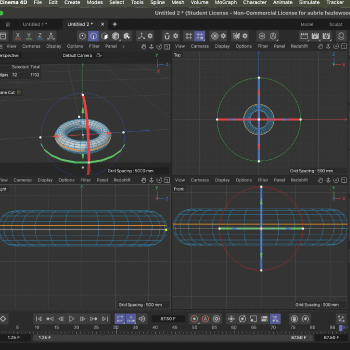
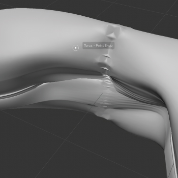
In steves first tutorial video, he demonstrated how to add segments in the polygon mode and I found that it would be interesting to try and apply it to my headband. In earlier images and photographs, it is evident that the. Headband is scrunched fabric that connects in the middle. In design challenge 1, I had decided to not attempt this on cinema 4dd, as I did not have the skillset, however after watching the first tutorial video, I wanted to try to experiment. The video didn’t mention specifically putting a bevel on the path, so I had tried that initially. It did not turn out as I would have intended, and found that using the extrude tool the sink the shape into the torus  followed by the bevel to make the transition smoother gave a much more transitional effect.
The video didn’t mention specifically putting a bevel on the path, so I had tried that initially. It did not turn out as I would have intended, and found that using the extrude tool the sink the shape into the torus  followed by the bevel to make the transition smoother gave a much more transitional effect.
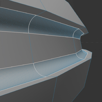
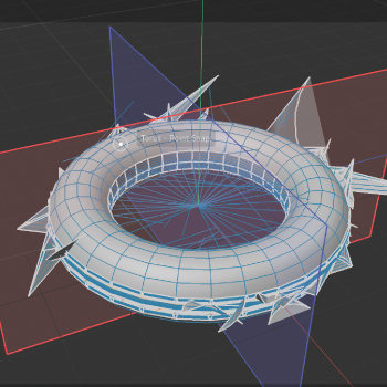
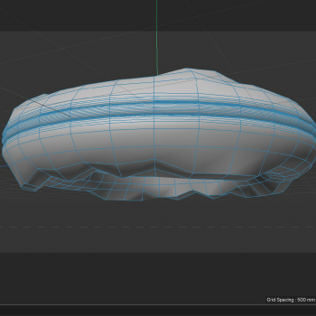
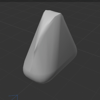
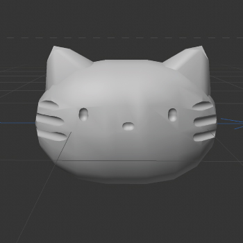
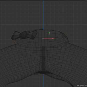
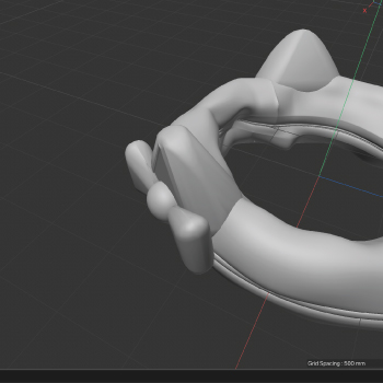
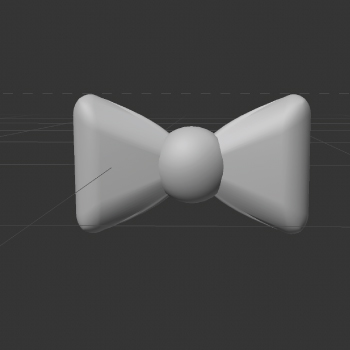
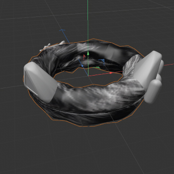
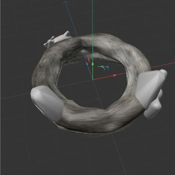
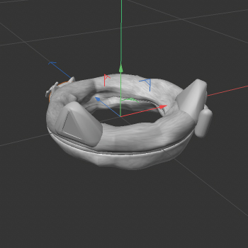
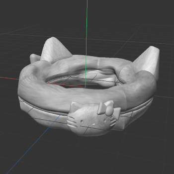
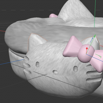
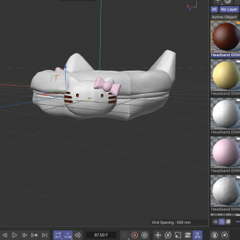
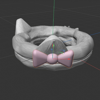
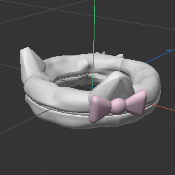
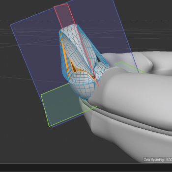
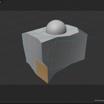
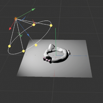
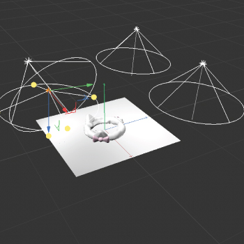
In this image, I wanted to show what happened when I tried to play around some more with the bevel tool when I had accidentally clicked off of the ring segments that I had selected one by one and it had created this crazy shape! I referred back to the tutorial video and noticed that Steve had used the loop selection tool. To easily and accurately select the segments needed. Moving forward, I had utilized this tool a lot!. in this image, I was trying to play around with the sculpting tool. In this image, I played around with mainly the knife and extrude sculpting tool and tried to create fabric-like bumps and ridges. This image is one of the beginning renditions of the cat ears that are on the headband. I had mainly relied on using the bevel tool to round edges to give it a much softer look. Relying on the sculpting tool also helped me a lot and it made the uniformity of the ear more playful and fun to look at. in Steves third tutorial, he relies on the multiple uses of the camera quite a bit. He often uses these angles to statically move objects rather than dynamically to achieve consistency placement which I found to be a really large issue for me in the last challenge. in this image, I had used Steves technique of adding segments within the polygon to add vertical bumps and ridges. I was really going for this fabric- type of look and within the tutorials, this method seemed to be the best way of capturing the illusion of texture I was going for in this image, I had used the polygon mode to create a capsule shape, and scale it to the requirements that I needed. I had even brought in the shape to create something less circular, but more like an oval- like shape. in this image, I really relied on Steve in the second tutorial when he talked about realigning the objects axis. When an object is created, it automatically aligns with the main axis set at 0. In assignment 1, I had lots of difficulty and confusion when trying to find objects/ move them around. However, he showed in the tutorial how to realign the axis so as it is in its correct spot. When doing this, I also made sure to check various views to ensure that the object was in line with its own axis in this image, I wanted to showcase the individual components of this piece. One thing I noticed that really helped me stay organized in this module was grouping and labelling!! Grouping the objects made it so much easier to keep organized and I felt like I saved so much time with finding specific objects rather than just clicking around mindlessly. in this image, I relied heavily on the route tool and the use of various camera angles to achieve a seamless attachment of the bow to the ear. I also relied on the images that I took to determine exact placement as Steve explained in the video. these images are the references that I had used to accurately recreate textures. In the third tutorial watched, Steve showed us how to use Bumpmaps to give objects more depth. I installed them from adobe stock and then changed their colours in adobe photoshop. This image is one of the beginning renditions of my headband colouring scheme. In photoshop, the image seemed to be much lighter than what is being demonstrated in the headband. I had forgotten to take in the fact that many parts of my object will have lots of shadows. this image is a final rendition of the colour scheme of the main portion of the headband. In photoshop, I lowered the saturation and also added more white tones into the grayscale so that the fur fibres can still be visible, but have a more natural look to them. This image is a representation of using a rotational view to ensure that the hello kitty is in the proper position. in this image, I wanted to demonstrate the use of colour and shape. I had used a slightly different texture for the hello kittyy figurine to make the fur fibres more prominent. in this image, I wanted to show the final product in reference to the object I had taken the picture of. This image shows the different textures I had created within photoshop and later applied to the design. in this image, I wanted to show how I utilized the rotation tool to ensure proper placement of the bow in regards to the image provided. I also wanted to show to process of determining if textures were effectively recreated. this picture shows the final product of what I was trying to represent. It shows how I utilized modelling techniques, textures, and the polygon tool! in this image, I wanted to show how I learned to use the symmetry tool and the perspective view to make sure that dimensionally, everything was proportionate and properly attached. this image is a representation of the beginning stages of the first tutorial using the make circle tool. I didn't end up using this method in my final product, but I wanted to play around with the tool and become familiar with it. in this image, I wanted to make use of the axis and symmetry tool and then replicate it on the other side of the headband. this image was an attempt at me playing around with the bevel tool. I tried to use simple shapes in assignment one to try and get an idea of the logistics of the tool. I also utilized the use of multiple camera angles to be able to understand how the tool worked. this image is me finally playing around with the lighting. I was super excited to get to this step because I wanted to understand how the tool worked!! Initially, I started with one light and noticed very harsh shadows. In this picture, I wanted to find a way to minimize the amount of harsh shadows found on the platform. Another thing I wanted to point out that I forgot to record was that I initially could not find a way to be able to get it to actually show up. I ended up finding out that a plane was needed to be put underneath.

Material Workshop 1
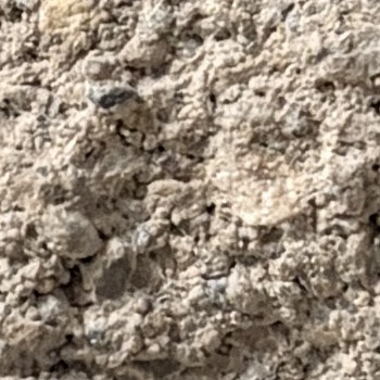
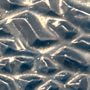
I was really drawn to this texture because its rough, rigid nature. I wanted to look for different ways to express the use of texture within a piece. I wanted to reference the reading and think
      about how certain textures can evoke certain emotions. I wanted to think about how I could apply the concept of rigidity and harshness to a piece of work, more specifically one of my objects. I thought this texture was really interesting because it carried many soft/ smooth textures, yet was counter-balanced by some shapes that evoke sharpness.
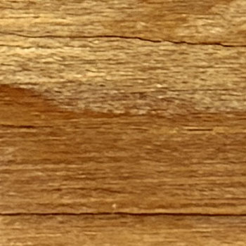
      The way the light played with the texture made it so that soft bumps and ridges were created, but the light also worked in a way that sharpened the triangular forms within the texture. I felt really drawn to the wood grain pattern because I liked its natural ability to form organic shapes. I felt very drawn to the way the swirls occured naturally and how there are darker shades of orange/brown tones throughout the piece.

Material Workshop 2

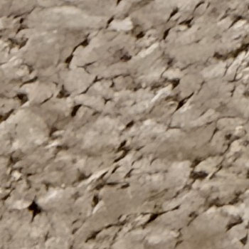
This is an image of a corkboard found on campus. I thought this texture was really interesting because of the way that the colours contrast eachother, with the bright brown hilights
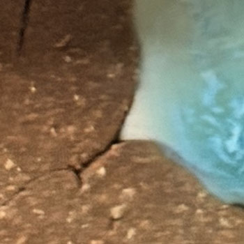
      and the dark shadows that emphasize the depth of the board itself. I thought about how colour is a very important tool for conveying depth, and texture. This is a close up image of a clay sculpture found in the AA Wing.
      I felt particularily drawn to this piece because there was actually 2 contrasting textures happening at the same time. On one side, there is a small amount with dry but once malleable clay, with soft ridges indicating work from human hands.
      on the other hand, there is a lighter texture happening, which is actually a glass interior. The glass has distinct hilight points, along with darker shades of blue for its shadows. I have really been interested in using fabric-like textures in some examples in my work. For example, in design challenge 2 (mentioned above), I experimented with the
      use of fabrics and what the process would look like. I find that replicating the different textures via computer program proves to be very difficult, and it is something I would like to continue to explore further in my work.

Project 1

Published 3D Model 1

For my Apple Watch, I chose it because it is an object that I use every day, and rely on for many of my basic functions. It is something that I use when I am going about my day by monitoring my fitness goals, reminding me of specific things I have to get done for that day, and keeping me on track for my general daily activities. Prior to my use of a digital watch, I was very forgetful and would often unintentionally leave things to the last minute. However now, I am able to reach good productivity levels without feeling stressed which improves my physical, and mental health.
Loading apple watch.glb...

Published 3D Model 2

I chose my cactus as an object because I want to show how it ties in to all my themes mentioned before. I was really drawn to its organic shapes and I wanted to give myself a challenge of recreating them. I thougt a lot about the reading on how the emotions evoked by an object can influence the way that it is designed. I asked myself a lot about what kind of emotions were going through my head when I looked at images of my object. I noticed how their spikey nature made me feel a little afraid, and I felt like when im around this object I need to be on guard so as to not be harmed by the bristles.
Loading cactus plant.glb...

Published 3D Model 3

As for my final object, this tassel represents a very monumental milestone in my life that I worked very hard to achieve. It reminds me of many experiences in which I underwent to be able to thrive in secondary education and the hard work it took for me to be able to be where I am today. I faced a lot of struggles within my time in secondary school, and it was very hard for me to remember to do things along with managing my time wisely. However, with a lot of perseverance I was able to take action and make steps to further improve my professional habits!
Loading tassle.glb...
×

Powered by w3.css